After massive earthquakes such as the one in Pakistan yesterday that has killed over 30,000 people so far, people often ask if earthquakes are on the rise. The short answer is no, according to the National Earthquake Information Center, comments from
televangelists notwithstanding.
Surprisingly, they (the NEIC, not the televangelists) don't have much in the way of graphs on their site, at least that I could find, so I took the liberty of doing some myself. I'm no seismologist or statistician. But I think these graphs I've created are interesting.
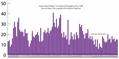
First, I graphed the annual number of earthquakes greater than 7.0 from 1900-2004 (Graph 1, above).
Conclusions:
• The frequency of major earthquakes does seem to come in waves, based on my unstatistical analysis (small number of sample years, and not knowing what would constitute a statistically significant wave vs. random groupings.) See 1905-1919, 1934-1951, and 1968-1976.
• However, we have had all less than average years in number of greater than 7.0 earthquakes since 1977, except for 1995 which was 1/2 an earthquake above average.
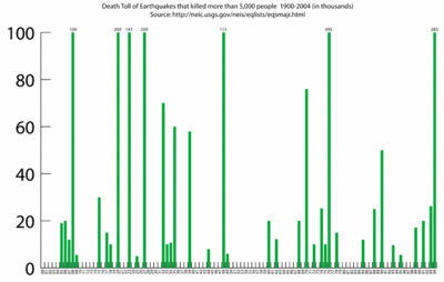
Then, I graphed the death toll of all earthquakes that killed more than 5,000 people (Graph 2, below). This is harder to draw any conclusions from without being some kind of statistician, because obviously population has grown since 1900, but presumably construction on average is better able to withstand an earthquake better than in previous times (although in a lot of countries that's debatable.)

Several interesting things though:
• To my untrained eye, they do look like they occur in clumps. But this could be totally random.
• There was not one earthquake that killed more than 5,000 people in all of the 1950's.
• In 1976 alone, there were 4 separate earthquakes that killed more than 5,000, including the biggest one of the century that killed 250-650 thousand in China (the other 3 were in New Guinea, Philippines, and Guatemala.) If anyone wanted to draw some ad hoc conclusions about the frequency of earthquakes, I think '76 would've been the year for it.
• Counting the earthquake yesterday, I think 2003, 04, and 05 have been the first years on record for the last 100 years that more than 20,000 have died in massive earthquakes 3 years in a row.
On this chart, I cut off the graph tops at 100,000 (of the 6 quakes that killed more than 100,000) so it's easier to compare the lower numbers. The numbers at the tops of those bars represent the death toll in thousands. A couple of the quakes I averaged between official and higher estimates, but that doesn't really change the overall data too much.
Final conclusions (for me anyways)? Certainly there are "earthquakes in various places", but it seems like they are about the same as always, both in frequency and death tolls. I think the reason it seems like there are more is because of our instant media and 24-hr cable news. So the next time some one tells you earthquakes are on the rise, pull out these handy charts!

